Still haven't had free time to play with Photoshop CS3 much, beyond taking a few screenshots (also posted below). I have noticed several differences though, and John Nack of Adobe comments on some of them.
John Nack on Adobe: Exploring the new Photoshop interface The newly refined user interface in the Photoshop CS3 beta represents a bit of a departure from the past several versions of the application.
see also this video overview by Deke McClelland.
Tags: Photoshop

screenshots from Photoshop CS3 beta. More explaination of these options than in CS2.
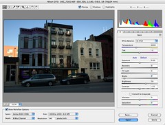
screenshots from Photoshop CS3 beta. New options.
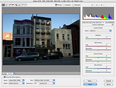
screenshots from Photoshop CS3 beta
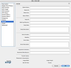
screenshots from Photoshop CS3 beta. I have no idea what this is for (only educated guesses)

screenshots from Photoshop CS3 beta
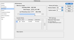
screenshots from Photoshop CS3 beta
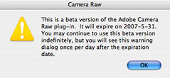
screenshots from Photoshop CS3 beta
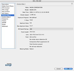
screenshots from Photoshop CS3 beta
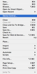
screenshots from Photoshop CS3 beta
I guess for cell phone content?
a quickr pickr post
